As this project was largely exploratory, the following were our main research objectives to validate the assumptions of the situation presented to us.
We had 2 main objectives as we embark on our research
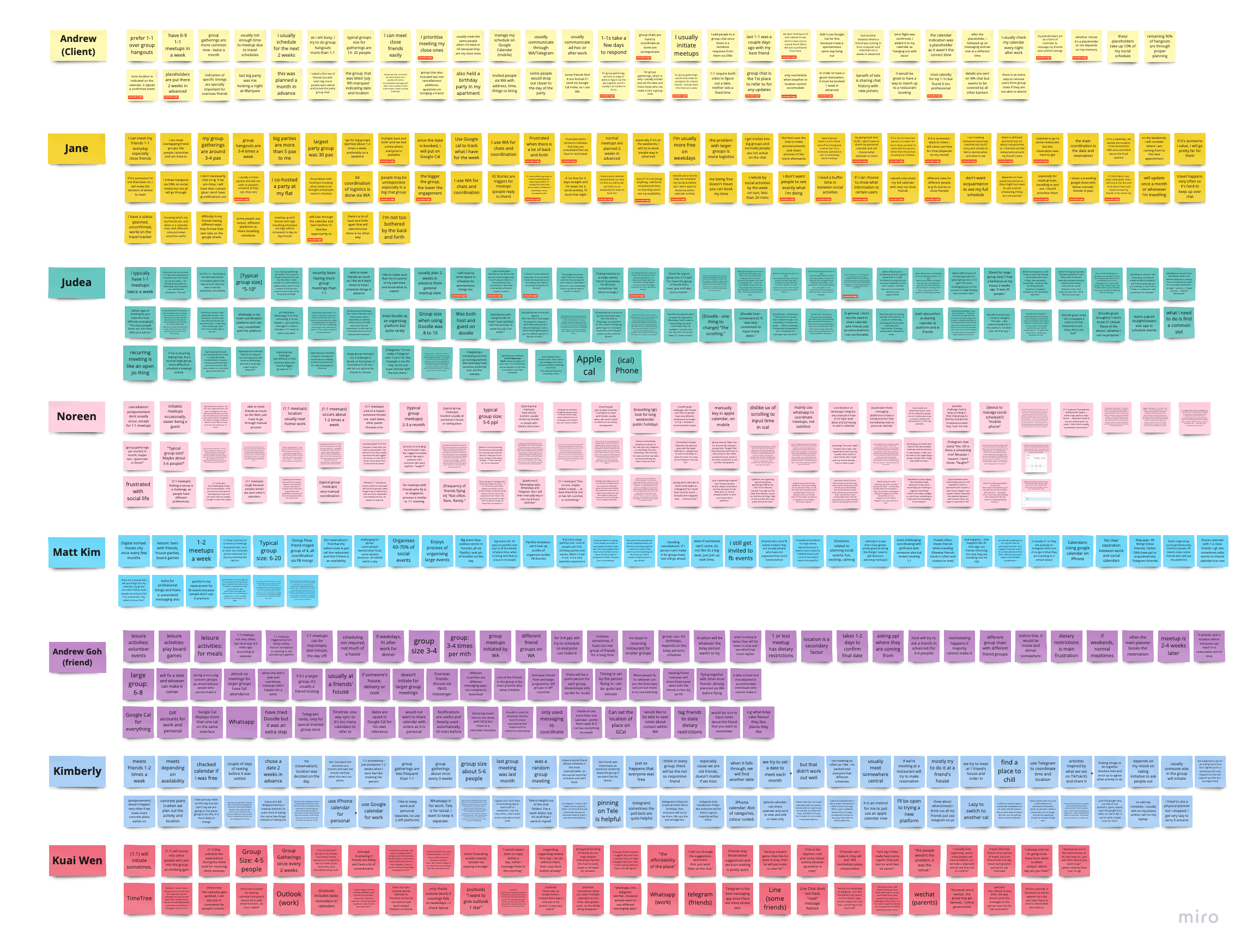
We conducted user interviews to understand our users better. Apart from tech expats, we targeted busy young working adults and triangulate the common patterns.
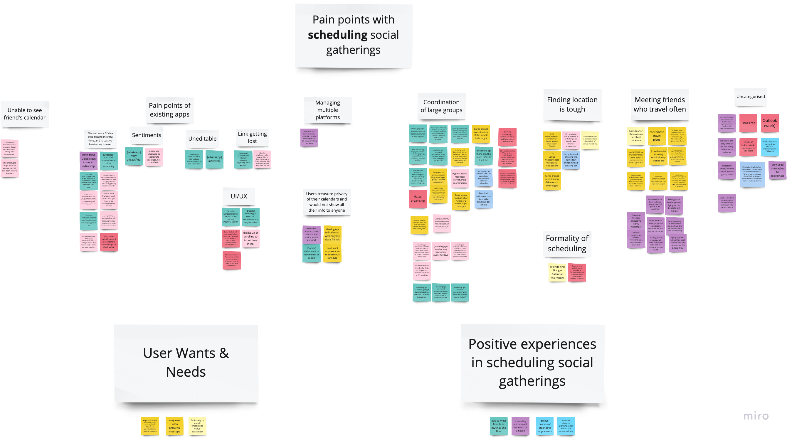
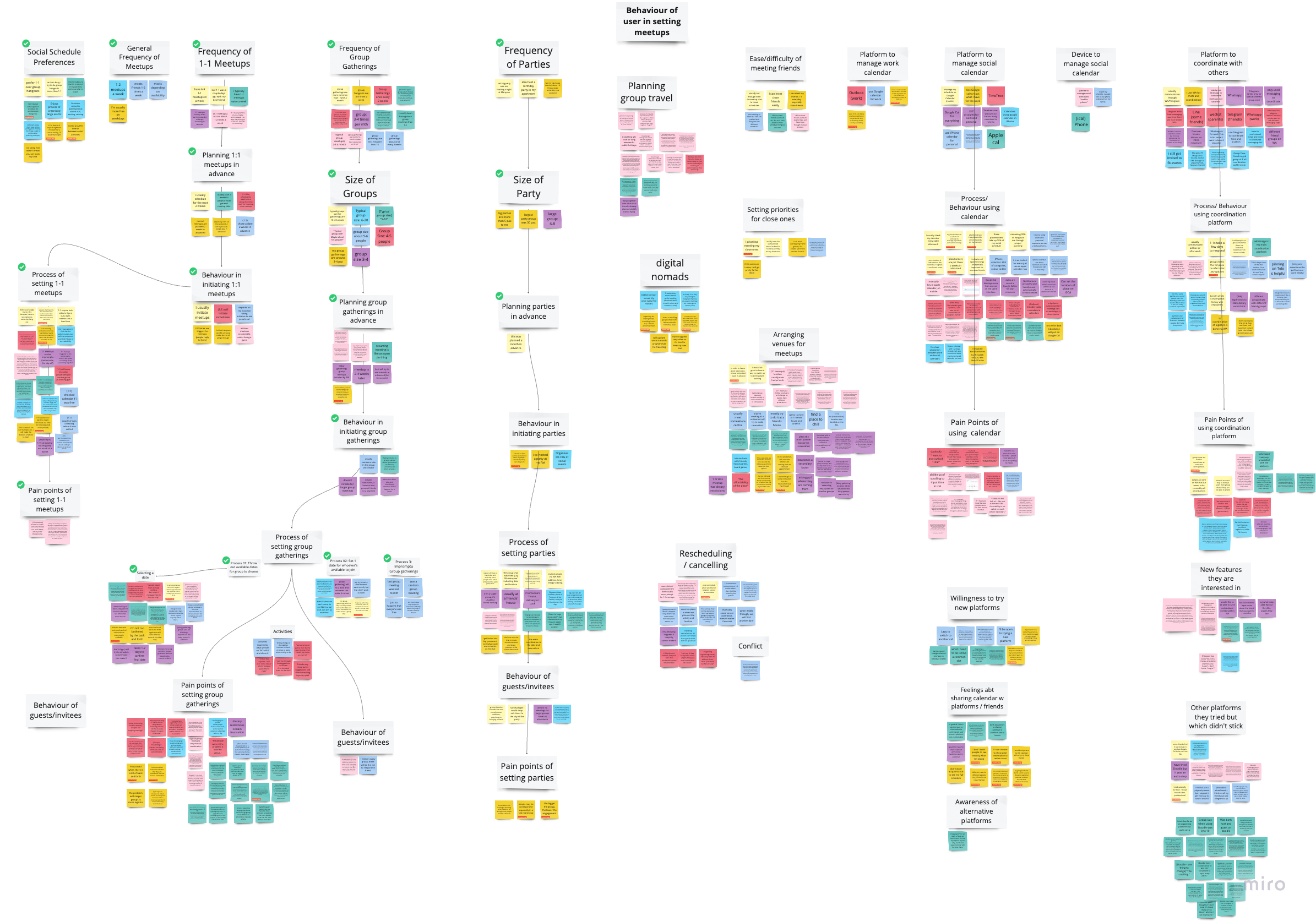
As there were a number data we collated, we went through 2 rounds of affiinity mapping


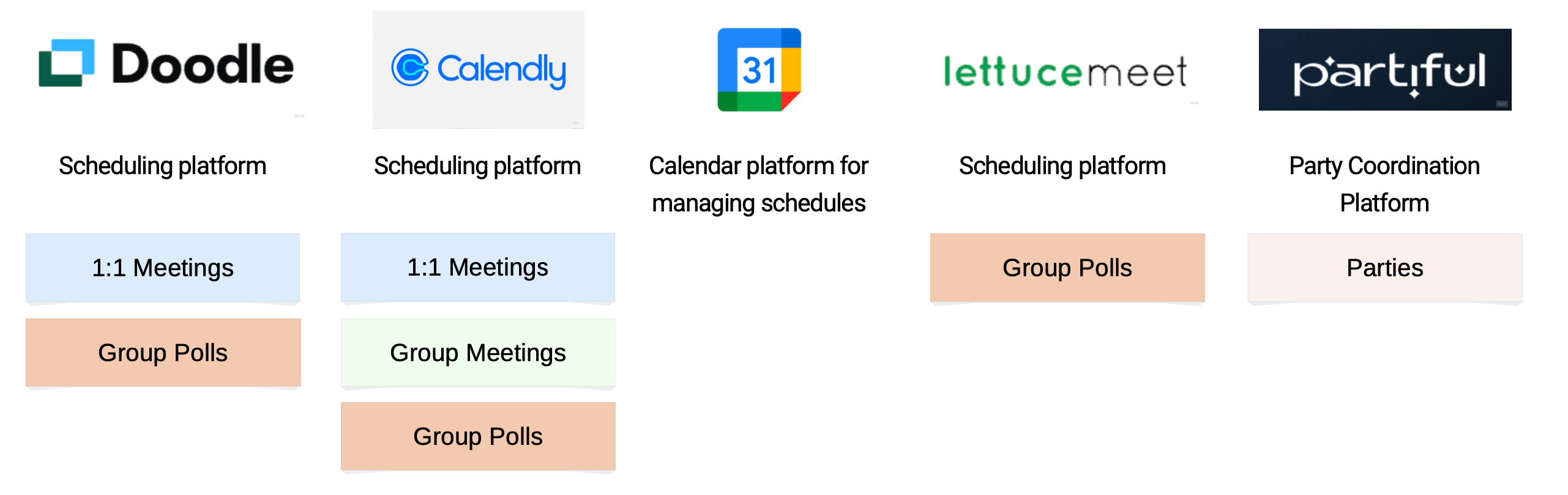
Alongside, we conducted competitor analysis on the following competitor applications to tease out gaps and opportunities. We discovered that there are various aspects to scheduling and following listed are the key functions which help us to what products is available in the market.
We synthesised both the user interviews and competitor analysis and derived the following insights

We knew that there was not product in the market currently for people to schedule their social meetups. Current scheduling platforms are deemed to be too professional and sharing the calendar was considered too private. It seems as though there is a dilemma between wanting to connect without breaching certain private affairs (or perhaps confidential).
We also had to consider the different aspects to designing for scheduling in the aspect of social meetups.
This prompts us to ask
How might we design a web-based platform that allows for an easy, smooth and convenient scheduling and responding to social meetups?
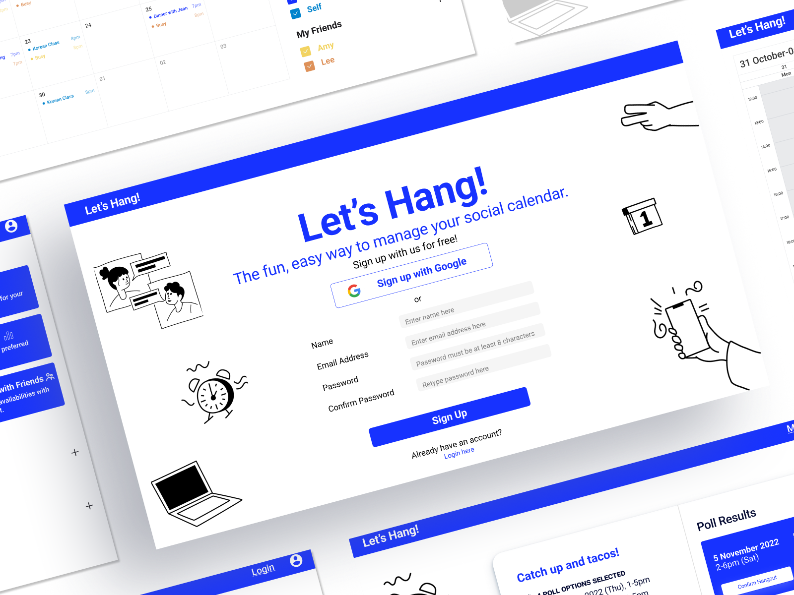
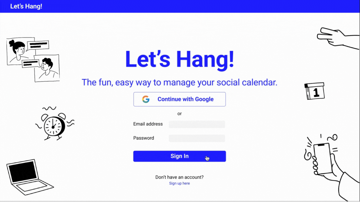
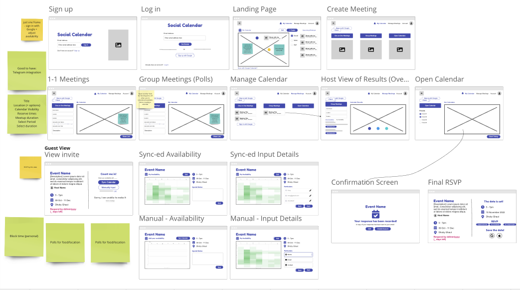
Let's Hang was designed with 2 main flows in mind.
For hosts who are throwing a party, baby shower or housewarming party which they have catered a date for.

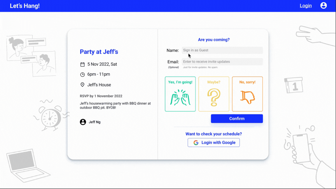
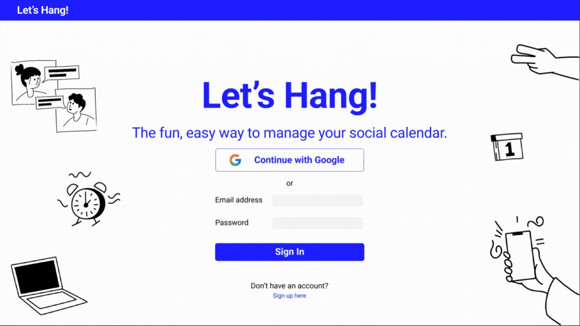
[Host] Initiating a housewarming party on 5 Nov
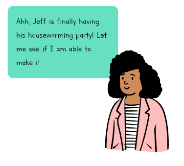
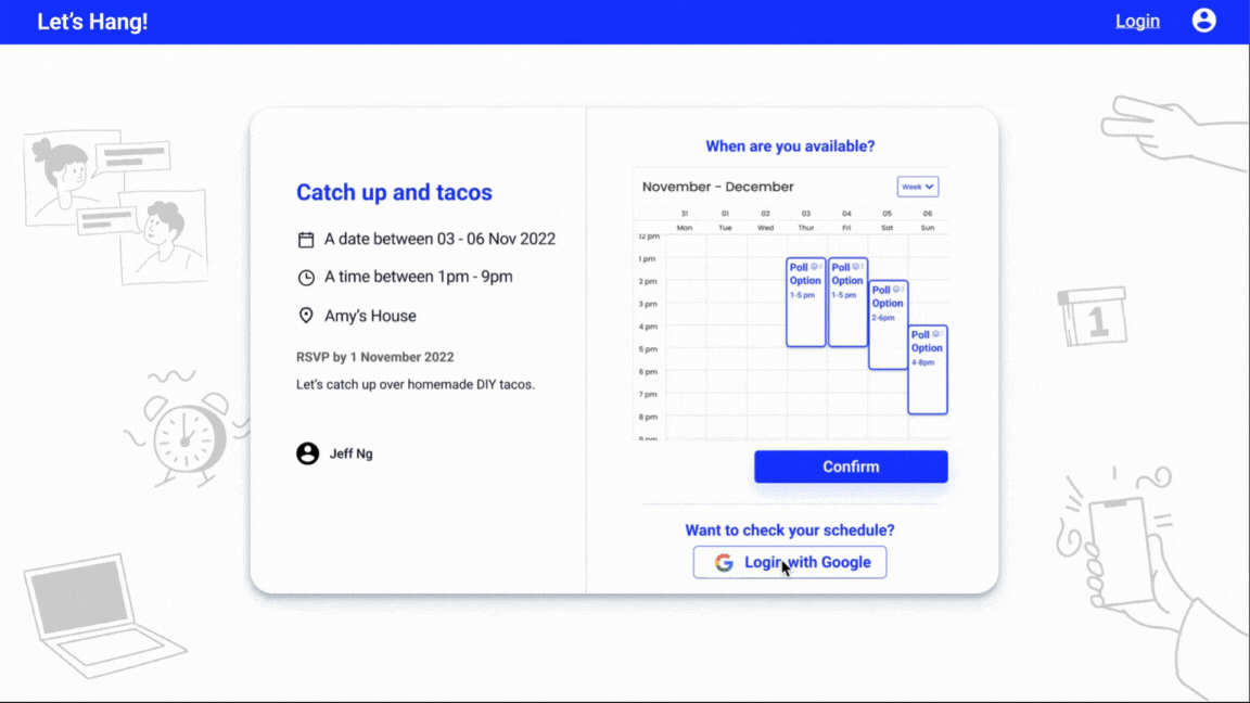
[Guest] Responding to invite

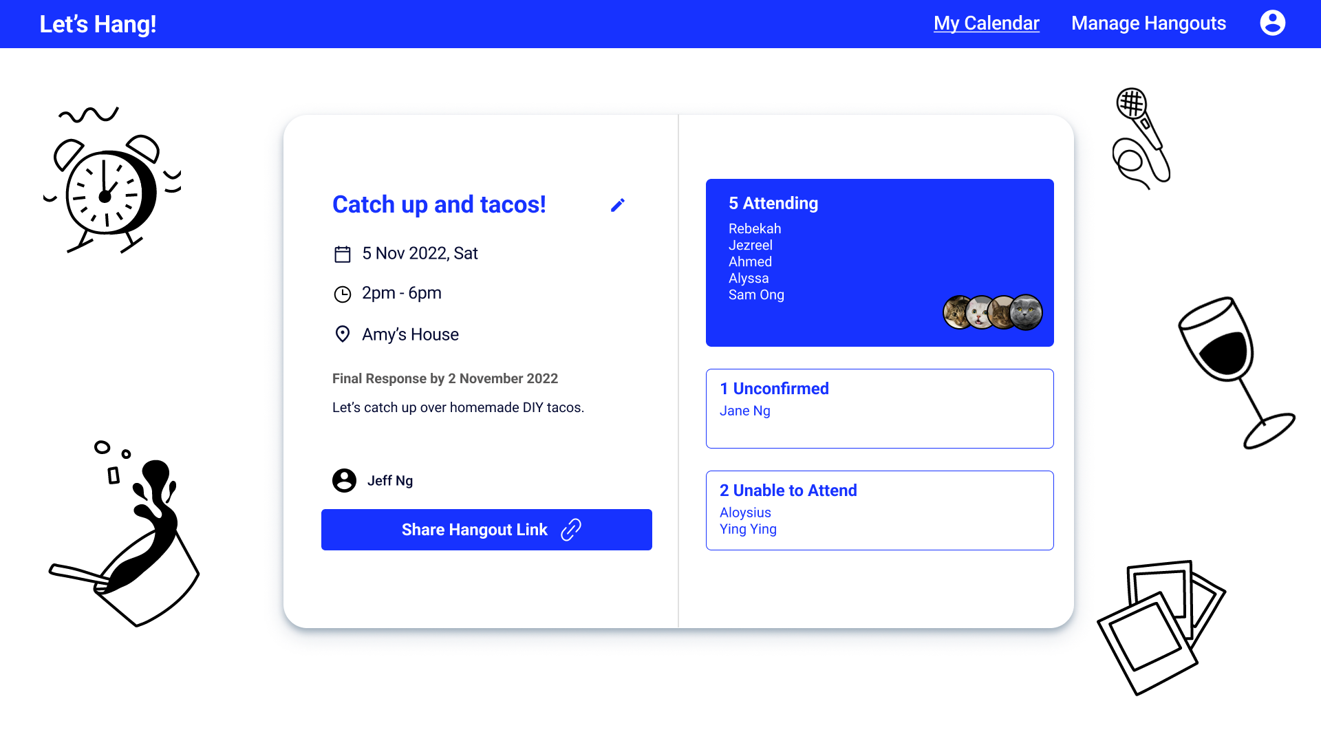
[Host] Checking responses

Hosting a school gathering with your high school friends? Check when everyone is free and go ahead with the best date!

[Host] Initiating a housewarming party on 5 Nov
[Guest] Responding to invite


[Host] Checking responses
As platform was still at the initial discovery phase, we were not able to test the launch product. Instead, we proceeded with our figma prototype
About 60% of the users found the platform easy to use at first interaction and more than 80% were satisfied with the platform.
While the results looks promising, there remains a concern about the actual adoption of the platform. Most users cited the condition of having their friend groups to adopt the platform for it to work.
The successful takeoff for the platform will conceivably increase with more time spent on
Little is made known about the desirability of social scheduling platforms. While the sentiments regarding adopting a new platform was positive during the stage of discovery, it is met with mixed reactions during Usability Tests 1 and 2
Integrating with commonly used platforms may reduce user friction from having to adopt a completely new platform.
As most social scheduling takes place on mobile devices, having a mobile responsive platform will ease the entire process of scheduling especially on the go and while away from a desktop device.
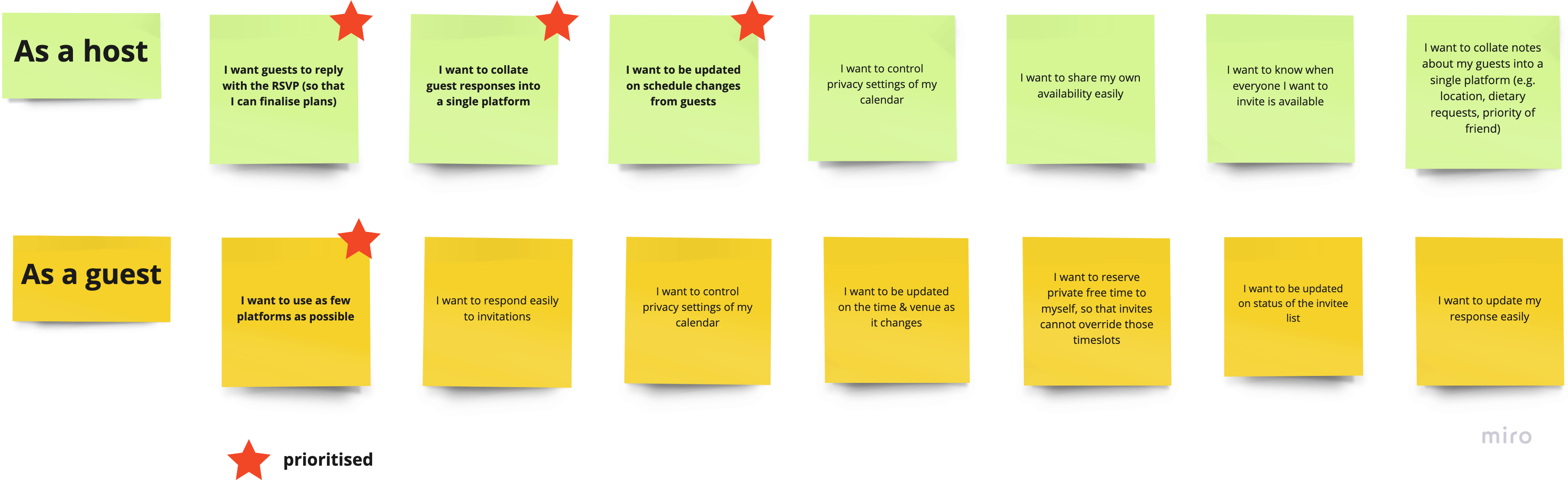
Looking back at our affinity map, we began to identify the pain points and asked ourselves what makes the planning for social meetup ideal.
As many have acknowledged that planning social gathering will involve quite a fair bit of effort, we asked ourselves
How can we make scheduling within friend groups easier?
We started to look at the an individual preference, possible circumstances each person might be in and the scenarios that may happen to the host and guest both individually and collectively.

We further streamline the process and prioritised the essential actionable insights for our MVP.
From there, we plotted the userflows for both the host and guest.

In the midst of the process, we discovered professional scheduling sites tend to prioritise 1:1 scheduling and group poll. However in the case of social meetups, we noticed Fixed Dates Meetups and Flexible Date Meetups tend to be the common trend.

We then replaced 1:1 and Group Poll Hangout types with
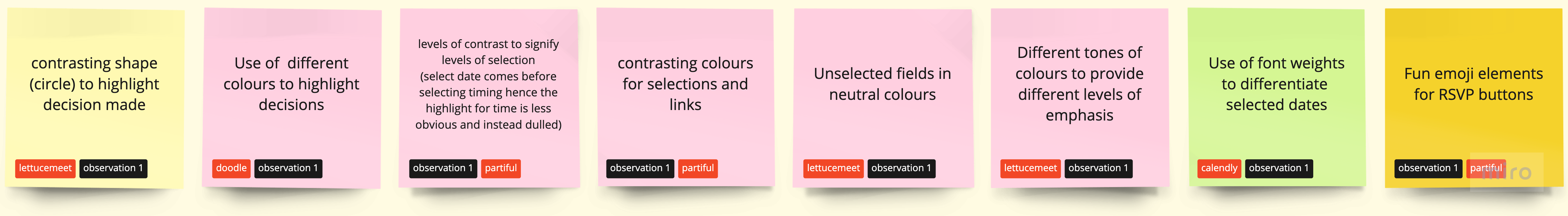
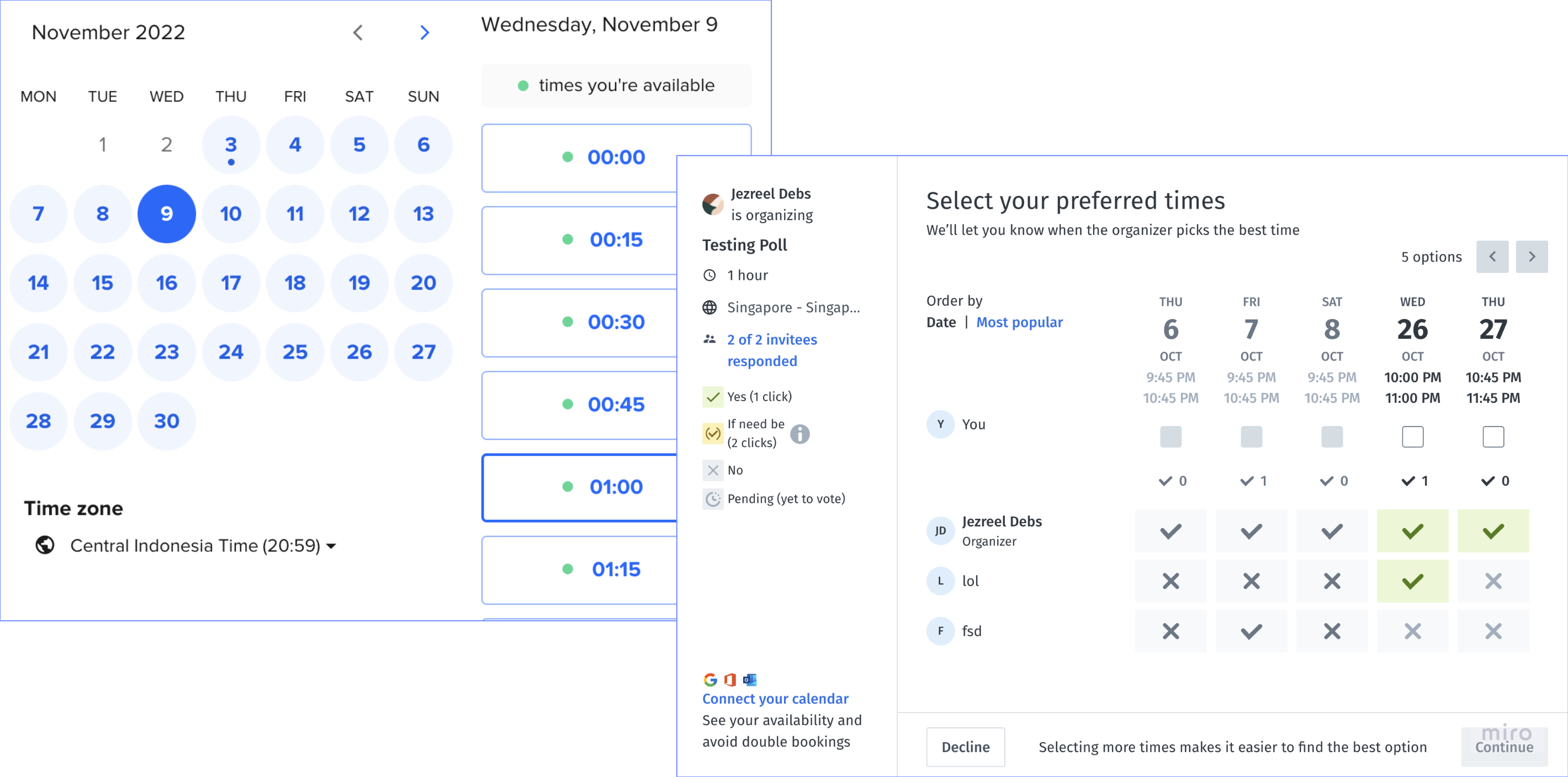
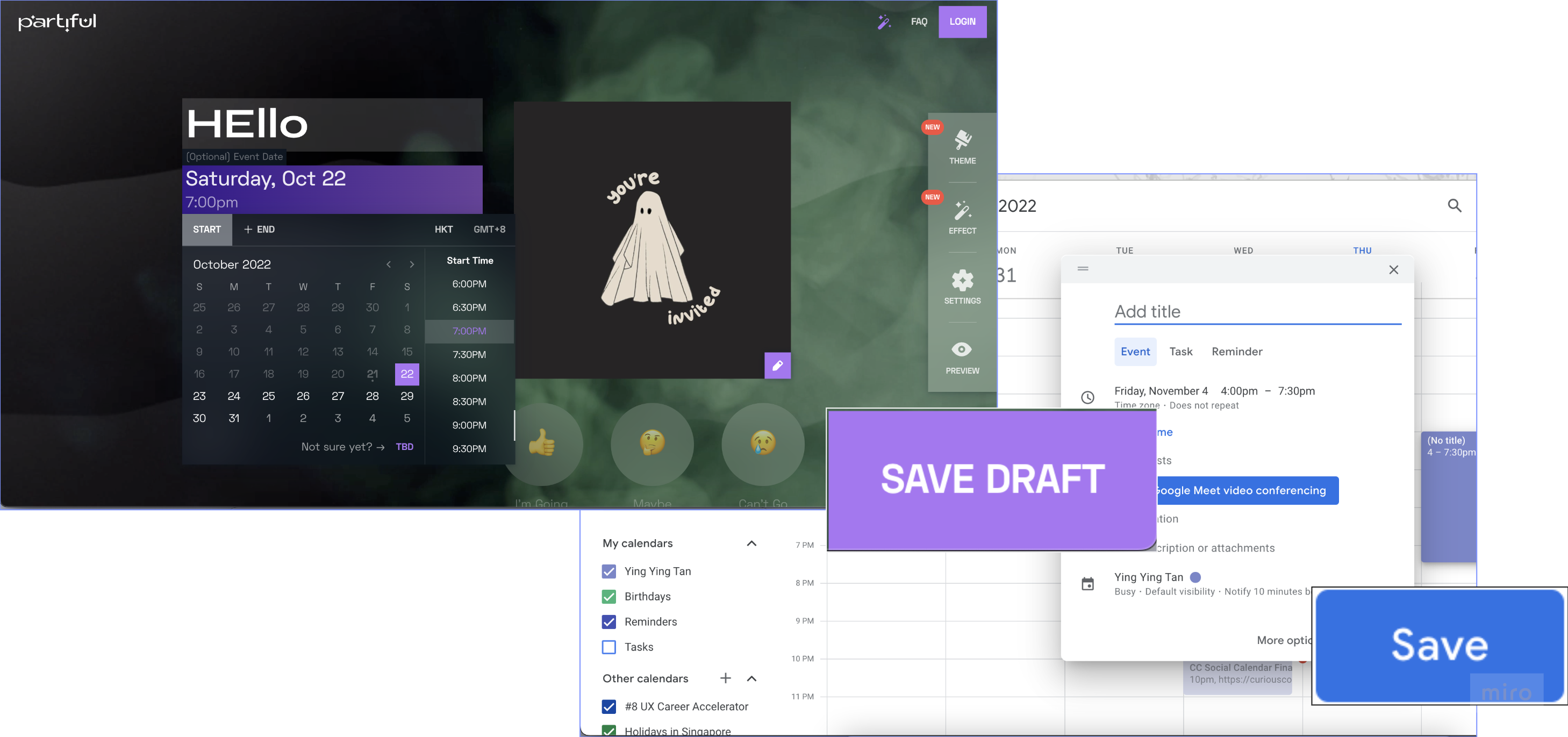
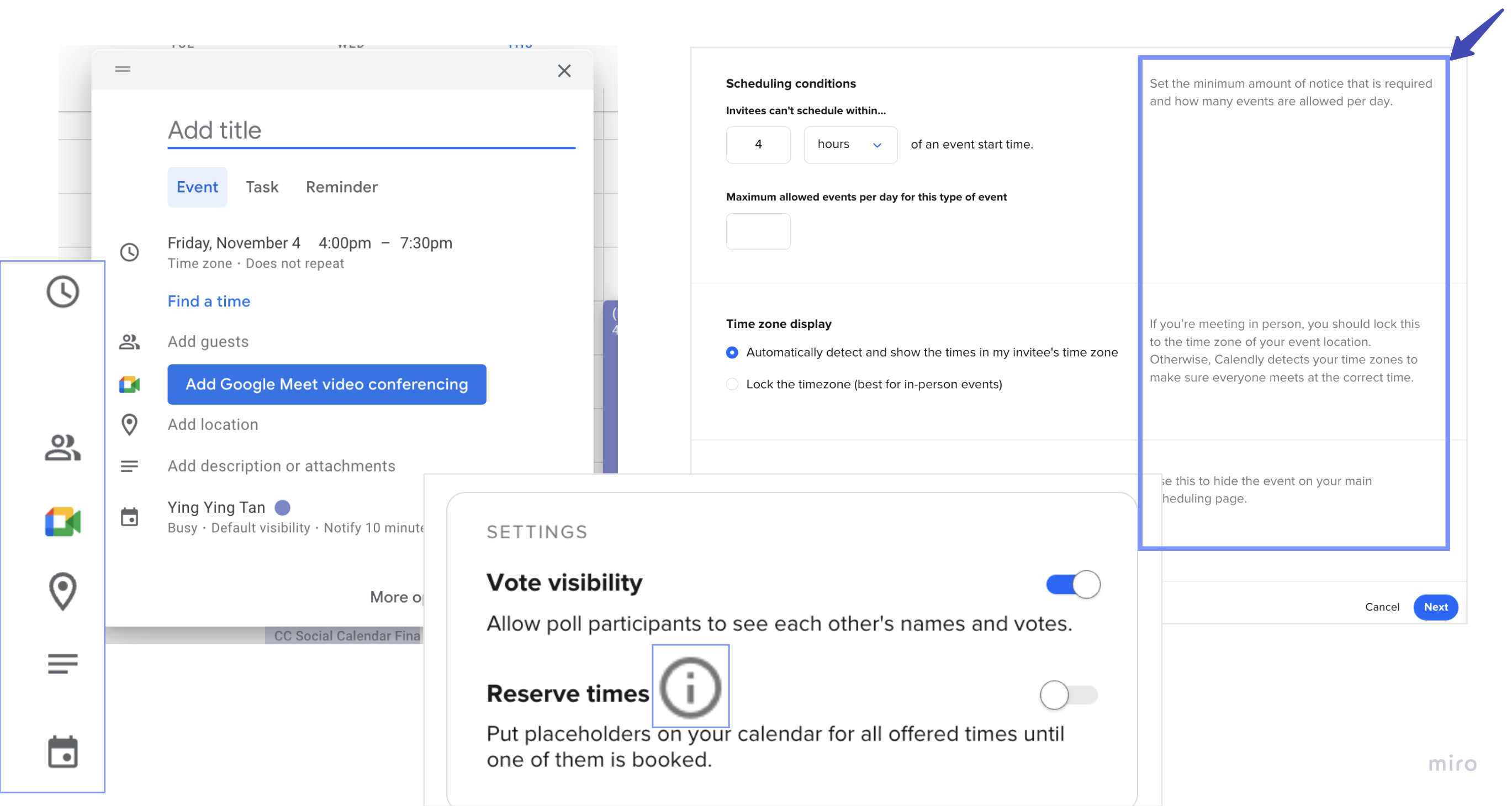
We looked at how different scheduling platforms are designed and what are the best practices that we could implement on our design.

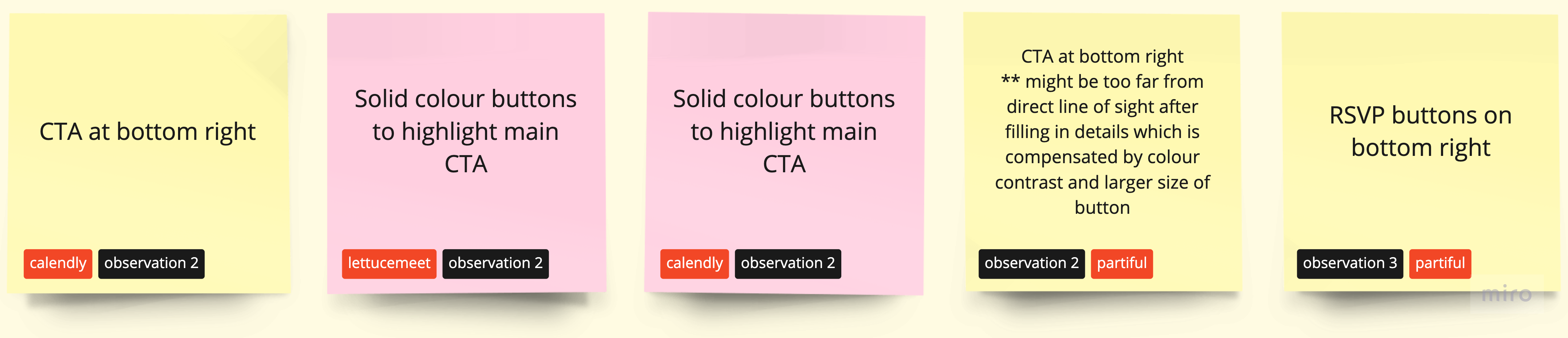
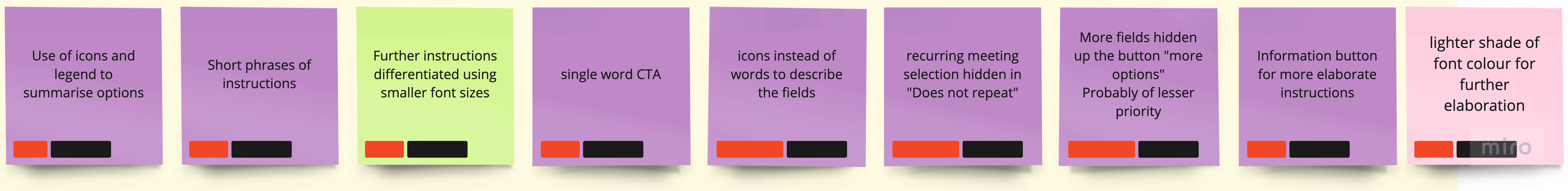
From the analysis, we teased out 3 main observations which guided our design process.
As the research team continue to refine the user flow, the design embark on lo-fi prototypes of the MVP. We sketched the following based on the initial user flow.
With time, there was more clarity as to how the platform should look like

We went through 2 rounds of usability testing with the aim of finding out the (1) ease of use, (2) desirability and (3) user satisfaction of the platform. After the first usability test, we refined our prototype before pushing out for a final test.
The results from the first usability test are as follows


We continue iterating on prototype. By the end of the second usability test, we found that while most scores remain favourable, the desirability scores were not the best.
The ease of usage is inevitably dependent on user adoption.
Many users cited that the platform will only be useful if their friends uses it. This brings us back to the need for further research on desirability and feasibility to integrate with well used applications.
This project has given me a taster of how the discover phase is essential for new products or solutions. There was little products available for the need of social scheduling. Hence, we spent bulk of our time interviewing those from our target audience.
There was also a number of times we had to relook at our research to go further. We found ourselves finding more trends each time we look back. At the same time we had to decide that we had sufficient to progress given the timeline.
The MVP designs were well-researched and validated to a certain extent through extensive user interviews and usability testing.