
AirAsia travelmall was designed and launched during the pandemic. In their 2020 usage study, they discovered that despite high purchase intention, the sales have only picked up slightly for in-flight travel, with no improvements for other collection methods after borders reopen.
Our broad priorities were to:
Based on our findings from user interviews, usability tests, and heuristic evaluations, three prominent shopper frustrations emerged.

Shoppers have little confidence in the Travelmall platform and the products which prevent them from exploring the platform further. They tend to only shop on established platforms that they trust.


Shoppers were not used to having to decide their delivery method before browsing the offerings. Selecting the delivery method also limited the exploration of platform leading to reduced carting out.

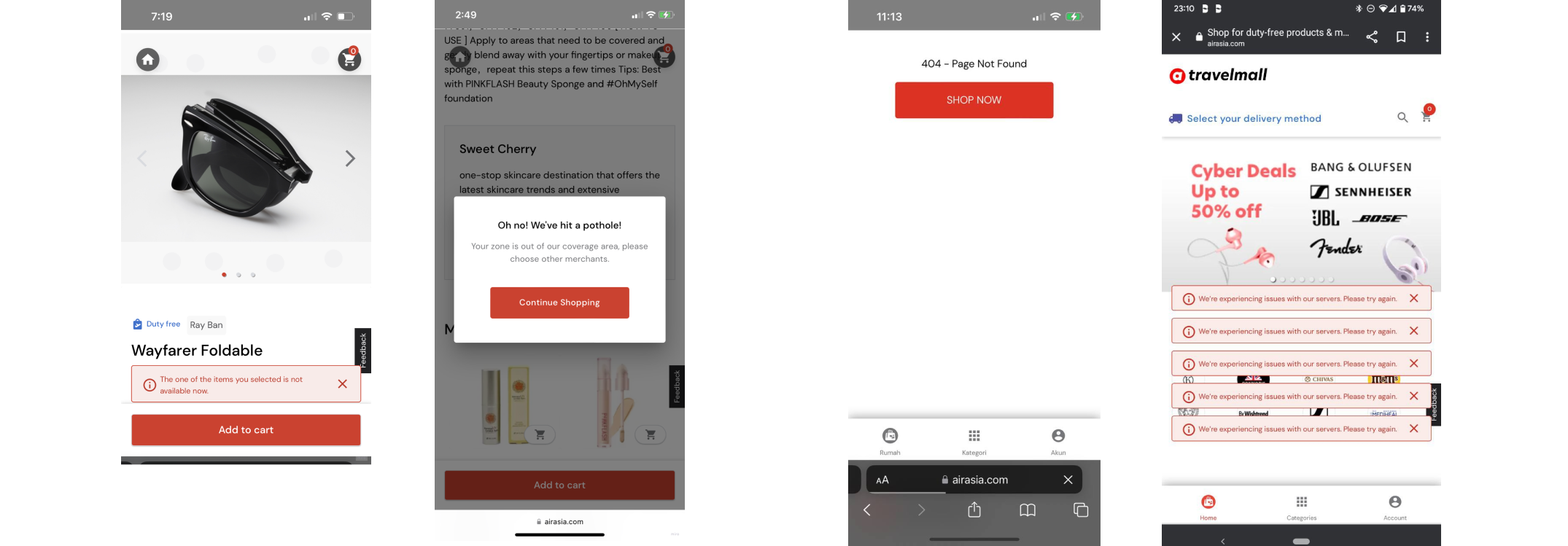
The selection of delivery method caused downstream issues. Shoppers faced at least 2-3 repeated errors with every minute of usage in part due to their selection of delivery method and the unfamiliar shopping flow. There was also little instruction of what went wrong.
Detailed findings can be found in the links below.
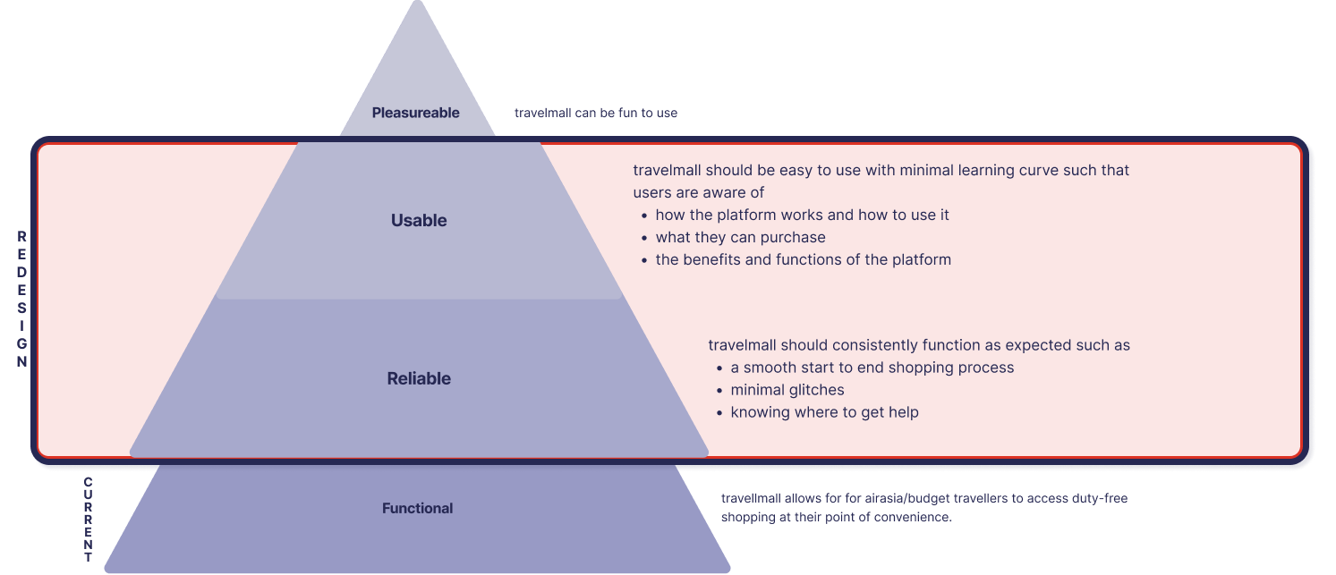
While Travelmall was functional, it lacked reliability and usability for duty-free shoppers who were new to the platform which may affect the likelihood of repeat purchase.
How might we improve the reliability and usability of AirAsia Travelmall so that shoppers feel confident to complete their purchases?
which is derived from
#1 Lack of trust
#2 Too much friction
#3 Too many errors
HMW create a online duty-free shopping experience that looks and feels reliable so that users feel safe to cart out.
HMW simplify the duty-free shopping experience so that shoppers can successfully check out?
How might we help shoppers back on track so that errors does not disrupt their shopping journey?
Ensuring a reliable platform is a recurring theme throughout the design process. From the get-go, we knew we had to tidy up the interface design for it to be perceived as intended.
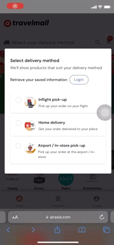
To ensure that we are not going in blind, we looked at the 3 other brands on how they establish legitimacy through their platform design and identified the key design patterns
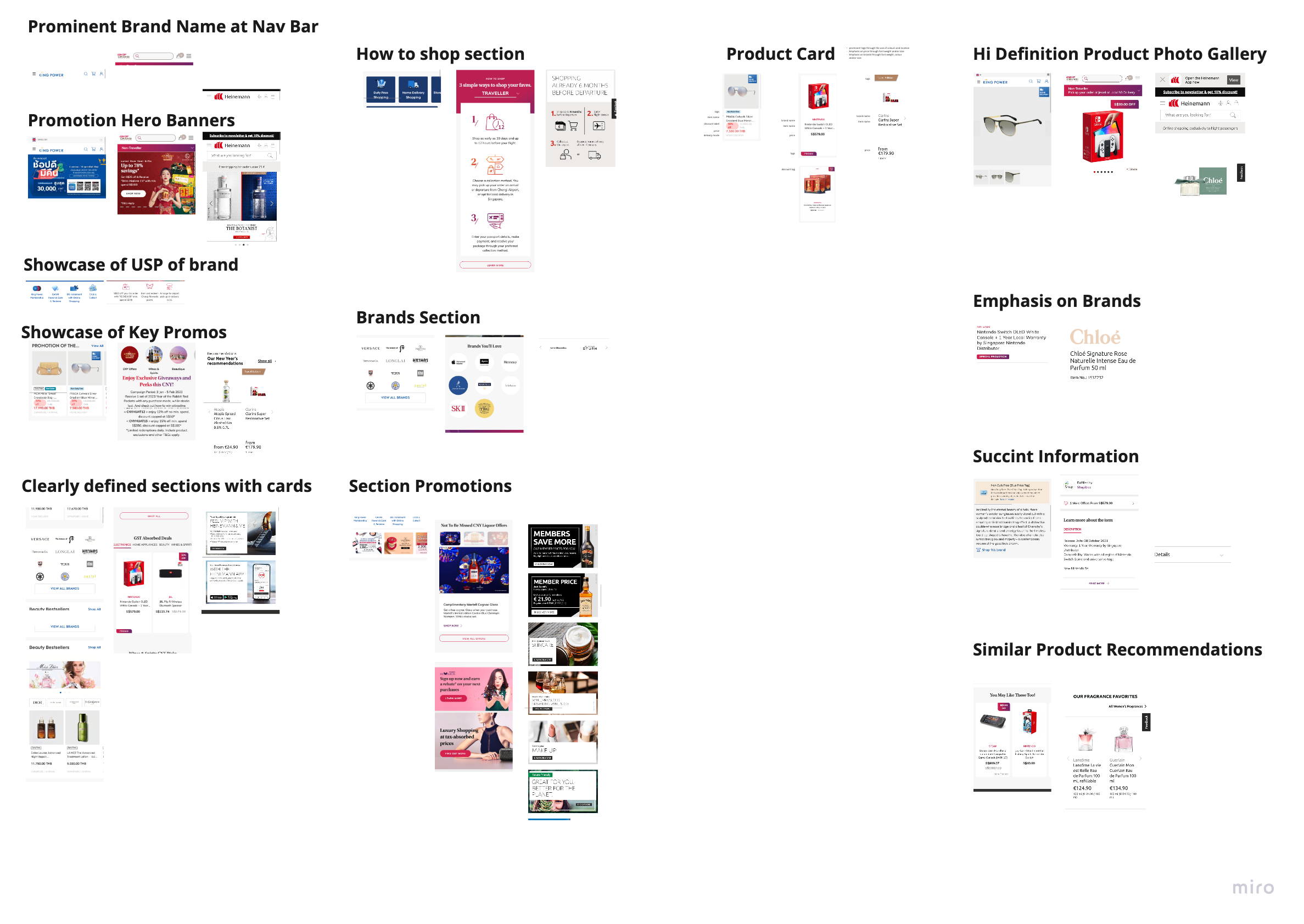
From there, we emphasised on the use of brand primary and secondary colours in our designs and created a few iterations before we went about with a quick preference test.
There was favourable results for the redesign (A) with an overall rating of 7-8 out of 10.

The next step was to build up the legitimacy through having a reliable platform that runs as expected. While the travelmall does have the key features for an online shopping site, it was not functioning as expected.
We relooked at the user flow as from the discovery, we knew that the step of choosing collection method was causing a number of issues downstream.
We listed down the scope we had to work with given what we have discovered and redesign the userflow.
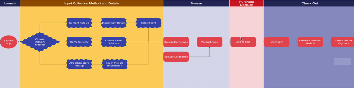
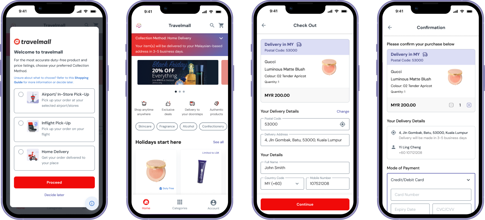
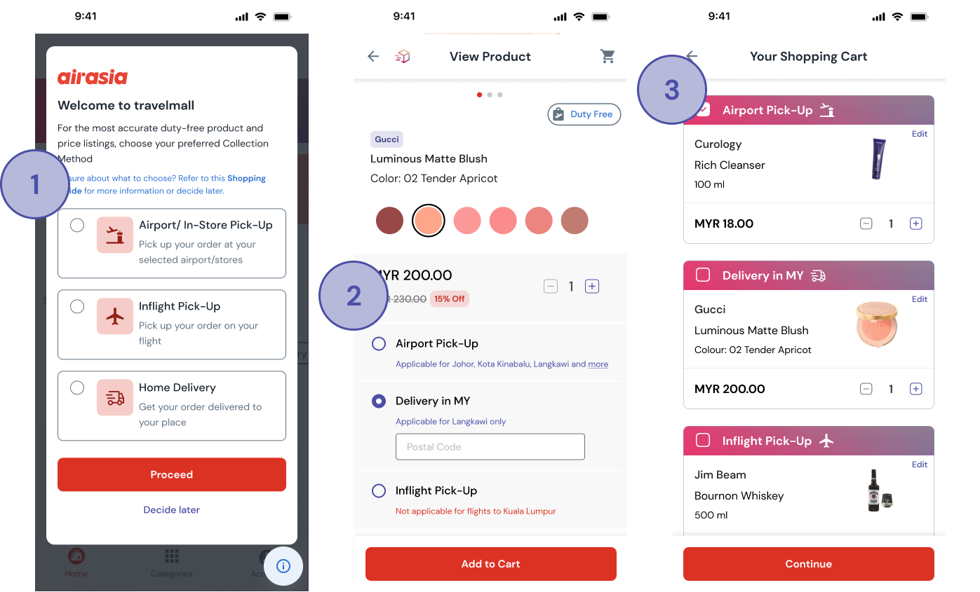
We prioritised the flexibility to choose the collection method at 2 key points - (1) Before Browsing (Launch), (2) After Browsing (Product Page). The collection method will also be confirmed at the (3) Checkout Stage.
To do so, it meant that we had to create the rightful circumstances for it to happen. We had 2 priorities in mind to minimise the barriers to browsing and decision making
We began brainstorming ways only helping users to decide which products they could purchase based on the region they are travelling to or fro.
With the tight timeframe, we assumed that airport codes was a universal indicator of airports given that there may be more than 1 airport in a single destination.

In order to help users to decide on the best delivery option, location information was also provided in the product page.

Following that was to ensure the users were able to adopt the platform by increasing the prominence of decision aids to help users to get started. We began looking back at what iShopChangi, Heinemann Shop and KingPower did in their design to provide necessary support to their users.

In a similar pattern, we look at how these design solutions could be weaved into the current design of airasia travelmall

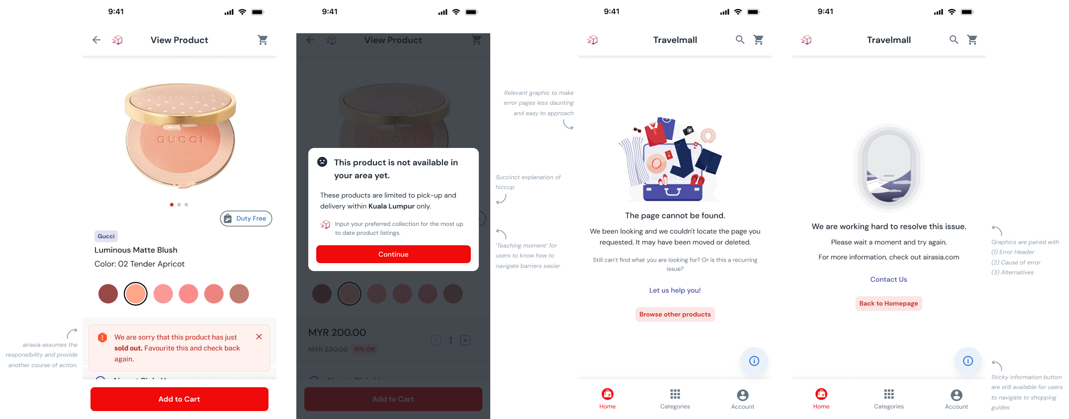
Lastly, while reliability of the site has increased, it is inevitable for users to still experience site failures. We referred to Neilsen Norman Group's Error Message Guideline to redesign the error pages.
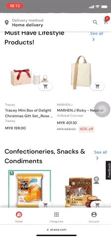
Travelmall's clean interface showcases relevant product details and provides consistent information, enhancing the appeal of duty-free shopping. This cohesive design fosters a sense of credibility.
Key information are displayed prominently, acting as decision making aids to help one understand each and every delivery method before finalising the purchase. With some familiarisation, it will be a breeze to navigate the site. Otherwise, help buttons can be found easily at the bottom right of the page.
Still unsure about what can be done on travelmall? There is the option to jump right into browsing the products before heading back to the first step! There will be the flexibility to move ahead or back as you shop for duty-free products on travelmall.
Unable to do what you intend to? Know what are the possible alternatives to circumvent the barriers.
We presented our findings to the airasia team, Capital A. We were surprised to find out that another client was joining in to the presentation.
With the wealth of information we had, we tried to conscise it as much as possible and reported the key findings. The following was the feedback we received
Great! I am impressed with the in-depth research insights with userflow... and some great design solutions.
The research insights provided to us helped our internal research team to look into areas that we missed out.
Thank you guys for revealing all the insights from user behavior, competitive benchmark, and usability testing. Really impressed on the details that you provide
While I have done a number of UX design work, this is the first time I conducted a UX audit. The timeline was definitely tight on top of the last minute grouping changes that occurred midway through the project. My team and I definitely over delivered by providing hi-fi protoypes of the design solutions.
While we received a number of positive feedback after our presentation, there were more in depth user research that can be done in the future that aligns with airasia business goal of launching a superapp